I also went to stanford.edu's analysis of their own advertisement and the things that make it effective. Stanford's approach featured more specific details, geared towards their own advertisements and their effectiveness. Purdue offered a broad examination of the themes and ideas that combine to create our knowledge of rhetoric.
With these readings in mind, I went in search of the most basic visual rhetoric I could find. I was looking for something even simpler than a structured photo. In this theme, I give you:
Effective Visual Rhetoric
Did you ever want to buy something from Billy Mays?
Don't lie. This man could sell dirt to a hobo.
The point, though, is that he represents visual rhetoric because, at the time of his death, he was a brand. He was sought after for infomercials because he made them his thing. It was what he did and his face lent a different, more serious register to a product. That is effective visual rhetoric.
Ineffective Visual Rhetoric
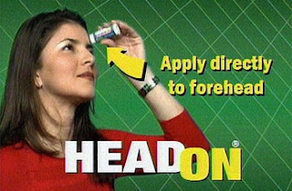
Do they even sell these monstrosities anymore? The slogan will haunt me to the grave and beyond, I'm, sure.
I was going to use Nike as my example of effective but not necessarily nice rhetoric, until I found this. I've never seen a sport equipment ad featuring an overweight person before. They are almost exclusively the "after" picture people.
Good on you, Nike. Good on you.
Bad Visual Rhetoric
I hope all of you remember this image from a few years back, but the reason it's on my blog now is because it is an excellent example of bad rhetoric. These advertisers are attempting to connect one extremely negative thing (gang rape) with one hopefully positive thing (don't you want to ooze sex like the people in this picture? Better shop Dolce and Gabbana). I actually believe this was a perfume ad, although why a woman would want a perfume that makes men jump her on rooftops is a little bit beyond me.
Really, Inexcusably Bad Visual Rhetoric
Font is an important aspect of visual rhetoric and this ad uses a terrible one. Comic Sans should be outlawed for anyone over the age of 13 and heavily discouraged for anyone under it. Here, it would be particularly inappropriate, but it's right up there with Papyrus on my design font shit list.


I have Billy Mays way down on my blog too! LOL
ReplyDelete